Motivation
The MIT App Inventor contains components for selection from lists, e.g. the ListView component. Unfortunately, it always fills the entire screen and you are only few options to configure the view. The extension presented here is a wrapper for the Android popup menu. Almost all properties are adjustable. If something is missing, write to me E-Mail to Ulli.
 or in black
Version history
| Version | Adjustments |
|---|---|
| 1.0.0 (2021-01-20) | Initial version |
| 1.1.0 (2021-09-21) | Method Dismiss added. |
Download
The UrsAI2Popup ZIP archive for download. The archive contains the source code, the compiled binary for uploading to the App Inventor and a sample application.
Usage
The popup menu is bound to another visible component (anchor). If it is opened via the Show method, it appears below the anchor component. If there is not enough space, it is displayed above.
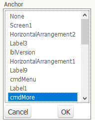
Integrating the extension into an AI2 project
The anchor component is selected in the designer. The component can be of any visible type. In the example it is the button with the name cmdMore. If Anchor is not selected, the app will abort.
Configuring menu items
First of all, the menu lines must be defined. There are various ways of doing this.
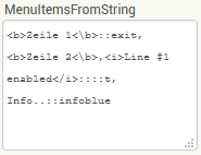
The MenuItemsFromString property is available in the designer and also at runtime. Individual item definitions are listed separated by commas:
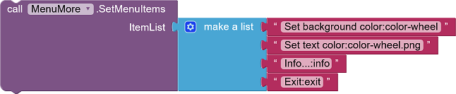
The SetMenuItems method allows the menu items to be defined as a list:
The menu definition can also be read from a file. In the Designer this is done using the MenuItemsFromFile property, and at runtime using the LoadMenuItemsFromFile function
The definition of a menu line consists of up to three parts, separated by a double colon (::):
<Titel>[::[<Icon-Name>][::T | F]]
This means: The mandatory title in hypertext format (the text that is displayed in the menu bar), optionally followed by a double colon and, if applicable, the name of the file with the image for the symbol. If a double colon and a "T" or an "F" follow, a check box is activated in the menu line. "T" or "F" indicate the check state.
Examples for the definition of menu items:
- "Info...": The menu line displays the text "Info...".
- "Info...::info.png": The menu line shows the text "Info...". The icon is
loaded from the "info.png" file.
- "Info...::info.png::True": The menu line shows the text "Info...". The icon
for the line is loaded from the "info.png" file. A CheckBox with state "checked" is added.
- "Info...::::False": The menu line displays the text "Info...". A CheckBox
with state "unchecked" is added.
Menu text
The text can contain HTML tags.
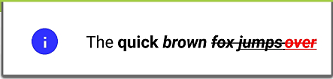
The <b>quick <i>brown <strike>fox <u>jumps <font color="red">over</font></u></strike><i></b>::info.png
results in this menu item:
Which HTML tags can be used depends on the implementation. You can find hints here or here.
Icon name
The name of the symbol file refers to an asset file, i.e. a file that was uploaded to the AI2 project.
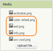
The file extensions ".png" or ".jpg" can be omitted. The extension searches for it automatically.The name is case sensitive!
CheckBox
The third item in the menu item definition determines whether a CheckBox is displayed. Only the first letter is evaluated here. Upper / lower case is not important. For example, "False" is synonymous with "f" and "true" with "T". Other characters than "t" or "f" are ignored, i.e. no checkbox is displayed.
Other Settings
MenuFontSize defines the text sizes of the menu items for the entire menu, MenuTextColor their text color. Whith Default the color is determined by the current theme definition. If MenuTextColor is used to specify a color, the color specifications in the hypertext code no longer work correctly. If regions of the hypertext are to be colored, MenuTextColor should be set to Default.
The background color of the menu is Black or White. With Default, the background color is determined by the current theme definition.
Note: Unfortunately, the background color of a menu cannot be set separately via the Android API. It is determined by the theme. The theme cannot be accessed through the program. However, AI2 provides two themes, one with a black background and a white foreground and the other vice versa. To set the background color, the menu's theme is set accordingly. Apart from the background color, the themes contain different settings for other elements of the view, such as the row height of the menus. This means that black and white menus are different in other items besides the background color.
At runtime, the CheckBox state of a menu item can be changed using the SetMenuItemChecked function. The item counting (ItemNo) starts at 1.
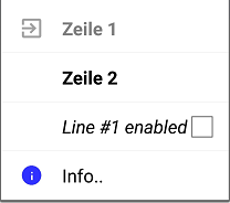
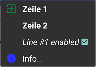
Individual menu lines can be deactivated using the SetMenuItemEnabled function. Text and symbols are displayed in light gray and the item no longer reacts to being clicked. The item counting (ItemNo) starts at 1.
The Designer's AutoCheck property can be used to determine whether the check status of the check boxes is toggled automatically when a menu line is clicked. The events provide the current, i.e. the toggled check state.
Events triggered by the pop-up menu
If a menu item is clicked, the MenuItemSelected event is triggered.
The parameter ID of the event is the number of the item, starting
with 1. Checked is the current, new check status if
AutoCheck is set.
In order to save extensive
if... else if... else blocks, the click events for the first five menu items are available
as separate events. MenuItemSelected is triggered before
MenuItem<x>Selected.
Reference
Properties
- Anchor
- Specifies the (visible) component below which the pop-up menu is displayed. If there is not enough space below the component, the menu is displayed above the specified component.
- AutoCheck
- Specifies whether the menu lines with checkboxes change their check state automatically when they are clicked.
- MenuBackgroundColor
- Defines the background color of the menu (see section Configuring menu items).
- MenuFontSize
- Specifies the font size of the menu items.
- MenuItemsFromString
- Defines the entries of the pop-up menu as a comma separated string (see section Configuring menu items).
- MenuItemsFromFile
- Specifies an asset file from which the definitions of the menu item are loaded (see section Configuring menu items).
- MenuTextColor
- Sets the text color of the menu items.
- Version
- Gets the version of the extension.
Functions
- Dismiss()
- Dismisses the menu.
- LoadMenuItemsFromFile(FileName)
- Loads the definition of the menu items from the specified asset file (see section Configuring menu items).
- SetMenuItems(ItemList)
- Defines the entries of the pop-up menu with a List (see section Configuring menu items).
- SetMenuItemChecked(ItemNo, Value)
- Sets the check state of the specified menu item. ItemNo is the number of the item. Counting starts at 1.
- SetMenuItemEnabled(ItemNo, Value)
- Enables / disables the specified menu item. ItemNo is the number of the item. Counting starts at 1. Disabled lines are displayed in light gray and do not react to being clicked.
- Show()
- Opens the menu.
Events
- MenuItem1Selected(Title, Checked)
- Menu item #1 was clicked.
- MenuItem2Selected(Title, Checked)
- Menu item #2 was clicked.
- MenuItem3Selected(Title, Checked)
- Menu item #3 was clicked.
- MenuItem4Selected(Title, Checked)
- Menu item #4 was clicked.
- MenuItem5Selected(Title, Checked)
- Menu item #5 was clicked.
- MenuItemSelected(ID, Title, Checked)
- The menu line with the number ID was clicked. The counting starts at 1.
Example PopupTest
 |
Most of the functions of the sample app are already been explained above. The menu items are bound to simple actions. |
Tools
I have gathered some tips for creating your own extensions: AI2 FAQ: Developing extensions.