 |
AI2 Component
(Version nb184)
|
|
AI2 Component
(Version nb184)
|
Public Member Functions | |
| ButtonBase (ComponentContainer container) | |
| boolean | onTouch (View view, MotionEvent me) |
| View | getView () |
| void | TouchDown () |
| void | TouchUp () |
| void | GotFocus () |
| void | LostFocus () |
| int | TextAlignment () |
| void | TextAlignment (int alignment) |
| int | Shape () |
| void | Shape (int shape) |
| String | Image () |
| void | Image (String path) |
| int | BackgroundColor () |
| void | BackgroundColor (int argb) |
| boolean | Enabled () |
| void | Enabled (boolean enabled) |
| boolean | FontBold () |
| void | FontBold (boolean bold) |
| void | ShowFeedback (boolean showFeedback) |
| boolean | ShowFeedback () |
| boolean | FontItalic () |
| void | FontItalic (boolean italic) |
| float | FontSize () |
| void | FontSize (float size) |
| int | FontTypeface () |
| void | FontTypeface (int typeface) |
| String | Text () |
| void | Text (String text) |
| int | TextColor () |
| void | TextColor (int argb) |
| abstract void | click () |
| boolean | longClick () |
| void | onClick (View view) |
| void | onFocusChange (View previouslyFocused, boolean gainFocus) |
| boolean | onLongClick (View view) |
 Public Member Functions inherited from com.google.appinventor.components.runtime.AndroidViewComponent Public Member Functions inherited from com.google.appinventor.components.runtime.AndroidViewComponent | |
| boolean | Visible () |
| void | Visible (boolean visibility) |
| int | Width () |
| void | Width (int width) |
| void | WidthPercent (int pCent) |
| void | setLastWidth (int width) |
| int | getSetWidth () |
| void | setLastHeight (int height) |
| int | getSetHeight () |
| void | CopyWidth (AndroidViewComponent sourceComponent) |
| int | Height () |
| void | Height (int height) |
| void | HeightPercent (int pCent) |
| void | CopyHeight (AndroidViewComponent sourceComponent) |
| int | Column () |
| void | Column (int column) |
| int | Row () |
| void | Row (int row) |
| HandlesEventDispatching | getDispatchDelegate () |
Additional Inherited Members | |
| Static Public Attributes inherited from com.google.appinventor.components.runtime.Component | |
| static final String | ASSET_DIRECTORY = "component" |
| static final int | ALIGNMENT_NORMAL = 0 |
| static final int | ALIGNMENT_CENTER = 1 |
| static final int | ALIGNMENT_OPPOSITE = 2 |
| static final int | ACCELEROMETER_SENSITIVITY_WEAK = 1 |
| static final int | ACCELEROMETER_SENSITIVITY_MODERATE = 2 |
| static final int | ACCELEROMETER_SENSITIVITY_STRONG = 3 |
| static final int | BUTTON_SHAPE_DEFAULT = 0 |
| static final int | BUTTON_SHAPE_ROUNDED = 1 |
| static final int | BUTTON_SHAPE_RECT = 2 |
| static final int | BUTTON_SHAPE_OVAL = 3 |
| static final int | COLOR_NONE = 0x00FFFFFF |
| static final int | COLOR_BLACK = 0xFF000000 |
| static final int | COLOR_BLUE = 0xFF0000FF |
| static final int | COLOR_CYAN = 0xFF00FFFF |
| static final int | COLOR_DKGRAY = 0xFF444444 |
| static final int | COLOR_GRAY = 0xFF888888 |
| static final int | COLOR_GREEN = 0xFF00FF00 |
| static final int | COLOR_LTGRAY = 0xFFCCCCCC |
| static final int | COLOR_MAGENTA = 0xFFFF00FF |
| static final int | COLOR_ORANGE = 0xFFFFC800 |
| static final int | COLOR_PINK = 0xFFFFAFAF |
| static final int | COLOR_RED = 0xFFFF0000 |
| static final int | COLOR_WHITE = 0xFFFFFFFF |
| static final int | COLOR_YELLOW = 0xFFFFFF00 |
| static final int | COLOR_DEFAULT = 0x00000000 |
| static final String | DEFAULT_VALUE_COLOR_NONE = "&H00FFFFFF" |
| static final String | DEFAULT_VALUE_COLOR_BLACK = "&HFF000000" |
| static final String | DEFAULT_VALUE_COLOR_BLUE = "&HFF0000FF" |
| static final String | DEFAULT_VALUE_COLOR_CYAN = "&HFF00FFFF" |
| static final String | DEFAULT_VALUE_COLOR_DKGRAY = "&HFF444444" |
| static final String | DEFAULT_VALUE_COLOR_GRAY = "&HFF888888" |
| static final String | DEFAULT_VALUE_COLOR_GREEN = "&HFF00FF00" |
| static final String | DEFAULT_VALUE_COLOR_LTGRAY = "&HFFCCCCCC" |
| static final String | DEFAULT_VALUE_COLOR_MAGENTA = "&HFFFF00FF" |
| static final String | DEFAULT_VALUE_COLOR_ORANGE = "&HFFFFC800" |
| static final String | DEFAULT_VALUE_COLOR_PINK = "&HFFFFAFAF" |
| static final String | DEFAULT_VALUE_COLOR_RED = "&HFFFF0000" |
| static final String | DEFAULT_VALUE_COLOR_WHITE = "&HFFFFFFFF" |
| static final String | DEFAULT_VALUE_COLOR_YELLOW = "&HFFFFFF00" |
| static final String | DEFAULT_VALUE_COLOR_DEFAULT = "&H00000000" |
| static final float | FONT_DEFAULT_SIZE = 14 |
| static final int | LAYOUT_ORIENTATION_HORIZONTAL = ComponentConstants.LAYOUT_ORIENTATION_HORIZONTAL |
| static final int | LAYOUT_ORIENTATION_VERTICAL = ComponentConstants.LAYOUT_ORIENTATION_VERTICAL |
| static final int | SCALING_SCALE_PROPORTIONALLY = 0 |
| static final int | SCALING_SCALE_TO_FIT = 1 |
| static final int | TYPEFACE_DEFAULT = 0 |
| static final int | TYPEFACE_SANSSERIF = 1 |
| static final int | TYPEFACE_SERIF = 2 |
| static final int | TYPEFACE_MONOSPACE = 3 |
| static final int | LENGTH_PREFERRED = -1 |
| static final int | LENGTH_FILL_PARENT = -2 |
| static final int | LENGTH_UNKNOWN = -3 |
| static final int | LENGTH_PERCENT_TAG = -1000 |
| static final int | TOAST_LENGTH_SHORT = 0 |
| static final int | TOAST_LENGTH_LONG = 1 |
| static final int | DIRECTION_NORTH = 1 |
| static final int | DIRECTION_NORTHEAST = 2 |
| static final int | DIRECTION_EAST = 3 |
| static final int | DIRECTION_SOUTHEAST = 4 |
| static final int | DIRECTION_SOUTH = -1 |
| static final int | DIRECTION_SOUTHWEST = -2 |
| static final int | DIRECTION_WEST = -3 |
| static final int | DIRECTION_NORTHWEST = -4 |
| static final int | DIRECTION_NONE = 0 |
| static final int | DIRECTION_MIN = -4 |
| static final int | DIRECTION_MAX = 4 |
| static float | SLIDER_MIN_VALUE = 10 |
| static float | SLIDER_MAX_VALUE = 50 |
| static float | SLIDER_THUMB_VALUE = (SLIDER_MIN_VALUE + SLIDER_MAX_VALUE) / 2.0f |
| static final String | DEFAULT_VALUE_TEXT_TO_SPEECH_COUNTRY = "" |
| static final String | DEFAULT_VALUE_TEXT_TO_SPEECH_LANGUAGE = "" |
| Protected Member Functions inherited from com.google.appinventor.components.runtime.AndroidViewComponent | |
| AndroidViewComponent (ComponentContainer container) | |
| Protected Member Functions inherited from com.google.appinventor.components.runtime.VisibleComponent | |
| VisibleComponent () | |
| Protected Attributes inherited from com.google.appinventor.components.runtime.AndroidViewComponent | |
| final ComponentContainer | container |
Underlying base class for click-based components, not directly accessible to Simple programmers.
Definition at line 47 of file ButtonBase.java.
| com.google.appinventor.components.runtime.ButtonBase.ButtonBase | ( | ComponentContainer | container | ) |
Creates a new ButtonBase component.
| container | container, component will be placed in |
Definition at line 125 of file ButtonBase.java.
| int com.google.appinventor.components.runtime.ButtonBase.BackgroundColor | ( | ) |
Returns the type%'s background color as an alpha-red-green-blue integer.
Definition at line 372 of file ButtonBase.java.
| void com.google.appinventor.components.runtime.ButtonBase.BackgroundColor | ( | int | argb | ) |
Specifies the type%'s background color as an alpha-red-green-blue integer. If an Image(String) has been set, the color change will not be visible until the Image(String) is removed.
@internaldoc If the parameter is Component#COLOR_DEFAULT, the original beveling is restored.
| argb | background RGB color with alpha |
Definition at line 390 of file ButtonBase.java.
|
abstract |
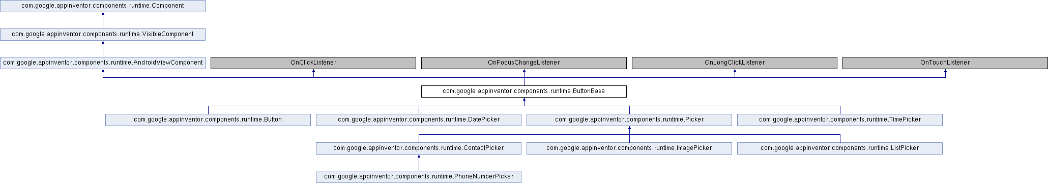
Reimplemented in com.google.appinventor.components.runtime.DatePicker, com.google.appinventor.components.runtime.TimePicker, com.google.appinventor.components.runtime.ContactPicker, com.google.appinventor.components.runtime.ImagePicker, com.google.appinventor.components.runtime.Button, and com.google.appinventor.components.runtime.Picker.
| boolean com.google.appinventor.components.runtime.ButtonBase.Enabled | ( | ) |
If set, user can tap type% to cause action.
Definition at line 510 of file ButtonBase.java.
| void com.google.appinventor.components.runtime.ButtonBase.Enabled | ( | boolean | enabled | ) |
Specifies whether the type% should be active and clickable.
| enabled |
Definition at line 522 of file ButtonBase.java.
| boolean com.google.appinventor.components.runtime.ButtonBase.FontBold | ( | ) |
If set, the text of the type% will attempt to use a bold font. If bold has been requested, this property will return true{:.logic.block}, even if the FontTypeface() does not support bold.
Definition at line 536 of file ButtonBase.java.
| void com.google.appinventor.components.runtime.ButtonBase.FontBold | ( | boolean | bold | ) |
Specifies whether the text of the type% should be bold. Some fonts do not support bold.
| bold |
Definition at line 550 of file ButtonBase.java.
| boolean com.google.appinventor.components.runtime.ButtonBase.FontItalic | ( | ) |
If set, the text of the type% will attempt to use an italic font. If italic has been requested, this property will return true{:.logic.block}, even if the font does not support italic.
Definition at line 597 of file ButtonBase.java.
| void com.google.appinventor.components.runtime.ButtonBase.FontItalic | ( | boolean | italic | ) |
Specifies whether the text of the type% should be italic. Some fonts do not support italic.
| italic |
Definition at line 611 of file ButtonBase.java.
| float com.google.appinventor.components.runtime.ButtonBase.FontSize | ( | ) |
The size of the font used for rendering the Text(String).
@internaldoc Returns the text font size of the type%, measured in sp(scale-independent pixels).
Definition at line 627 of file ButtonBase.java.
| void com.google.appinventor.components.runtime.ButtonBase.FontSize | ( | float | size | ) |
Specifies the text font size of the type%, measured in sp(scale-independent pixels).
| size | font size in sp(scale-independent pixels) |
Definition at line 640 of file ButtonBase.java.
| int com.google.appinventor.components.runtime.ButtonBase.FontTypeface | ( | ) |
The text font face of the type%. Valid values are 0 (default), 1 (serif), 2 (sans serif), or 3 (monospace).
Definition at line 657 of file ButtonBase.java.
| void com.google.appinventor.components.runtime.ButtonBase.FontTypeface | ( | int | typeface | ) |
Specifies the text font face of the type% as default, serif, sans serif, or monospace.
| typeface | one of Component#TYPEFACE_DEFAULT, Component#TYPEFACE_SERIF, Component#TYPEFACE_SANSSERIF or Component#TYPEFACE_MONOSPACE |
Definition at line 674 of file ButtonBase.java.
| View com.google.appinventor.components.runtime.ButtonBase.getView | ( | ) |
Returns the View that is displayed in the UI.
Reimplemented from com.google.appinventor.components.runtime.AndroidViewComponent.
Definition at line 193 of file ButtonBase.java.
| void com.google.appinventor.components.runtime.ButtonBase.GotFocus | ( | ) |
Indicates the cursor moved over the type% so it is now possible to click it.
Definition at line 219 of file ButtonBase.java.
| String com.google.appinventor.components.runtime.ButtonBase.Image | ( | ) |
Returns the path of the type%'s image.
Definition at line 316 of file ButtonBase.java.
| void com.google.appinventor.components.runtime.ButtonBase.Image | ( | String | path | ) |
Specifies the path of the type%'s image. If there is both an Image and a BackgroundColor() specified, only the Image will be visible.
@internaldoc
See MediaUtil#determineMediaSource for information about what a path can be.
| path | the path of the button's image |
Definition at line 335 of file ButtonBase.java.
| boolean com.google.appinventor.components.runtime.ButtonBase.longClick | ( | ) |
Reimplemented in com.google.appinventor.components.runtime.Button.
Definition at line 742 of file ButtonBase.java.
| void com.google.appinventor.components.runtime.ButtonBase.LostFocus | ( | ) |
Indicates the cursor moved away from the type% so it is now no longer possible to click it.
Definition at line 229 of file ButtonBase.java.
| void com.google.appinventor.components.runtime.ButtonBase.onClick | ( | View | view | ) |
Definition at line 749 of file ButtonBase.java.
| void com.google.appinventor.components.runtime.ButtonBase.onFocusChange | ( | View | previouslyFocused, |
| boolean | gainFocus | ||
| ) |
Definition at line 756 of file ButtonBase.java.
| boolean com.google.appinventor.components.runtime.ButtonBase.onLongClick | ( | View | view | ) |
Definition at line 767 of file ButtonBase.java.
| boolean com.google.appinventor.components.runtime.ButtonBase.onTouch | ( | View | view, |
| MotionEvent | me | ||
| ) |
If a custom background images is specified for the button, then it will lose the pressed and disabled image effects; no visual feedback. The approach below is to provide a visual feedback if and only if an image is assigned to the button. In this situation, we overlay a gray background when pressed and release when not-pressed.
Definition at line 169 of file ButtonBase.java.
| int com.google.appinventor.components.runtime.ButtonBase.Shape | ( | ) |
Returns the style of the type%.
Definition at line 279 of file ButtonBase.java.
| void com.google.appinventor.components.runtime.ButtonBase.Shape | ( | int | shape | ) |
Specifies the shape of the type%. The valid values for this property are 0 (default), 1 (rounded), 2 (rectangle), and 3 (oval). The Shape will not be visible if an Image() is used.
@internaldoc This does not check that the argument is a legal value.
| shape | one of Component#BUTTON_SHAPE_DEFAULT, Component#BUTTON_SHAPE_ROUNDED, Component#BUTTON_SHAPE_RECT or Component#BUTTON_SHAPE_OVAL |
| IllegalArgumentException | if shape is not a legal value. |
Definition at line 303 of file ButtonBase.java.
| boolean com.google.appinventor.components.runtime.ButtonBase.ShowFeedback | ( | ) |
Returns true if the text of the type% should be bold. If bold has been requested, this property will return true, even if the font does not support bold.
@suppressdoc
Definition at line 583 of file ButtonBase.java.
| void com.google.appinventor.components.runtime.ButtonBase.ShowFeedback | ( | boolean | showFeedback | ) |
Specifies if a visual feedback should be shown when a type% with an assigned Image() is pressed.
| showFeedback |
Definition at line 567 of file ButtonBase.java.
| String com.google.appinventor.components.runtime.ButtonBase.Text | ( | ) |
Returns the text displayed by the type%.
Definition at line 687 of file ButtonBase.java.
| void com.google.appinventor.components.runtime.ButtonBase.Text | ( | String | text | ) |
Specifies the text displayed by the type%.
| text | new caption for button |
Definition at line 699 of file ButtonBase.java.
| int com.google.appinventor.components.runtime.ButtonBase.TextAlignment | ( | ) |
Returns the alignment of the type%'s text: center, normal (e.g., left-justified if text is written left to right), or opposite (e.g., right-justified if text is written left to right).
Definition at line 246 of file ButtonBase.java.
| void com.google.appinventor.components.runtime.ButtonBase.TextAlignment | ( | int | alignment | ) |
Specifies the alignment of the type%'s text. Valid values are: 0 (normal; e.g., left-justified if text is written left to right), 1 (center), or 2 (opposite; e.g., right-justified if text is written left to right).
| alignment | one of Component#ALIGNMENT_NORMAL, Component#ALIGNMENT_CENTER or Component#ALIGNMENT_OPPOSITE |
Definition at line 263 of file ButtonBase.java.
| int com.google.appinventor.components.runtime.ButtonBase.TextColor | ( | ) |
Returns the text color of the type% as an alpha-red-green-blue integer.
Definition at line 713 of file ButtonBase.java.
| void com.google.appinventor.components.runtime.ButtonBase.TextColor | ( | int | argb | ) |
Specifies the text color of the type% as an alpha-red-green-blue integer.
| argb | text RGB color with alpha |
Definition at line 726 of file ButtonBase.java.
| void com.google.appinventor.components.runtime.ButtonBase.TouchDown | ( | ) |
Indicates that the type% was pressed down.
Definition at line 201 of file ButtonBase.java.
| void com.google.appinventor.components.runtime.ButtonBase.TouchUp | ( | ) |
Indicates that the type% has been released.
Definition at line 209 of file ButtonBase.java.
 1.8.16