Motivation
With smaller apps, the implemented functions can be triggered by a button. With larger apps, however, the available space quickly decreases and the layout becomes confusing. An ActionBar (ToolBar, App Bar) can help. There are a number of implementations, but I haven't found a sufficient one one and developed one by myself. Almost all properties are adjustable. If something is missing, write to me: Email to Ulli.
Version history
| Version | Adjustments |
|---|---|
| 1.0 (2021-01-17) | Initial version |
| 1.1 (2021-01-18 | - Assigment of Buttons (#1 & #2) corrected. - LeftButtonColor did not work. |
| 2.0 (2021-01-19) | The code from UrsAI2Popup was integrated as the menu. |
| 2.1 (2021-91-28) | There is no need to convert the symbol names into Unicode characters. The names of the symbols can be specified directly. |
| 2.2 (2022-02-26) | Symbol names (e.g. LeftButtonSymbol) can additionally accept the text
"blank". Then a blank character is displayed. Via properties LeftButtonImage and RightButtonImage images (image file as asset) can be set as background for the buttons. |
| 2.3 (2024-12-03) | - Designer properties provided with category - Error during initialization fixed (RightButtonImage) |
| 2.4 (2025-05-10) | Missing method SetMenuItemEnabled added. |
Integration of the extension into an AI2 project
Configuration of the title text field
Configuration of the popup menu
Download
The UrsAI2ActionBar ZIP archive for download. The archive contains the source code, the compiled binary for uploading to the App Inventor and a sample application.
Usage
The App Bar, formerly also known as the Action Bar, is one of the most important design elements of your own Android app. It provides a visual structure and interactive controls that many users are already familiar with.
By using the App Bar, the appearance of your own app becomes consistent with other Android apps, so that users can quickly and intuitively understand how to use the app. It's a special type of toolbar found at the top of every screen and used for branding, navigation, search, and actions. This extension makes it possible to implement an ActionBar in an App Inventor App.
Integration of the extension into an AI2 project
A HorizontalArrangement available at design time is filled with the toolbar at runtime:
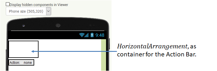
The extension sets the height of the ActionBar to 56 DIP (Pixel in AI2) and the width fills the parent element. If you want to have the correct dimensions at design time, you can set up the HorizontalArrangement accordingly. It also makes sense to name the component appropriately. In the example I named it ActionBarPlaceholder.
The HorizontalArrangement is registered in the UrsAI2ActionBar parameter PlaceHolder at design time:
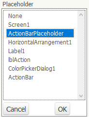
If this is not done, the HorizontalArrangement is not adjusted, and an ActionBar is not displayed. If the selected componenten is not of type HorizontalArrangement an ActionBar is not displayed and the event Screen.ErrorOccurred is triggered with the error number 7777.
In theory, it is not absolutely necessary to place the HorizontalArrangement at
the top of the display. The position of the HorizontalArrangement determines the position
of the action bar.
Note: Child elements contained in the arrangement are hidden.
Configuring the ActionBar
The functions to layout the ActionBar are available in the designer and as a block.
The best way to design them is to run the project in the Companion. Then you can immediately see what the
ActionBar looks like and test the functions.
The
ActionBar consists of the following components:
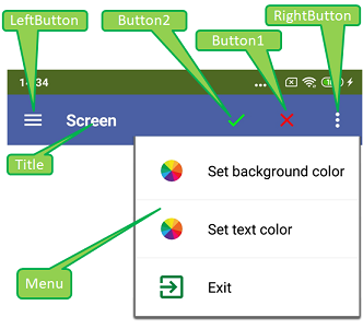
Die Symbolleiste besteht von links nach rechts aus der Schaltfläche LeftButton, dem Textfeld Title und drei weitere Schaltflächen Button2, Button1 und RightButton. Über RightButton kann ein konfigurierbares Popup-Menu geöffnet werden.
From left to right, the toolbar consists of the LeftButton, the Title text field and three further buttons, Button2, Button1 and RightButton. A configurable popup menu can be opened when RightButton is clicked.
Configuration of the title text field
The title text field is configured with AI2 usual properties. The Title property determines the text to be displayed. With property BackgroundColor the background color of the entire toolbar is set. With FontSize, FontBold and TextColor, the size, font weight and font color can be set. TextAlignment defines the alignment of the text.
Configuration of the buttons
The symbols displayed in the buttons are characters from a special TTF font. This simplifies the presentation in different sizes and colors.
Google provides extensive material to support app development. A large number of symbols are provided on the
Material Design / Icons page. These are also available
as a font (MaterialIcons-Regular.ttf, version 1.017). This font is embedded in the extension and is available for download
(folder "de\ullisroboterseite\ursai2actionbar\assets"). The name of the symbols (e.g. "arrowback",
"menu" or "more_vert") can / must be set with ... ButtonSymbol.
The
...ButtonColor property can be used to set the color of the symbol. Specifying "blank"
causes a space character to be displayed (useful if a background image is set).
The ...ButtonImage property can be used to set a background image for the button. On my test device the image was adjusted to the size of 155x155 pixels². The image should be square. Non-square images are distorted.
Configuration of the popup menu
The menu is identical to that in the extension UrsAI2Popup. It is linked to the right button (RightButton). If the left button is to be coupled with a menu, this can be done via an instance of the UrsAI2Popup extension. The placeholder component can serve as the anchor.
Events triggered by the ActionBar
When a button is clicked, the associated ...Click event is triggered.
RightButtonClick is triggered before the popup menu is assembled. The menu can be
adjusted at this event.
The events of the menu are described in section
Events triggered by the popup menu of extension
UrsAI2Popup.
Reference
Properties
- AutoCheck
- Specifies whether the menu lines with checkboxes change their check state automatically when they are clicked.
- BackgroundColor
- Defines the background color of the ActionBar. The default is & HFF4862A3.
- Button1Color
- Defines the color of th symbol of button #1.
- Button1Symbol
- Defines the symbol of button #1 (see section Configuration of the buttons)
- Button2Color
- Defines the color of the symbol of button #1.
- Button2Symbol
- Defines the symbol of button #2 (see section Configuration of the buttons).
- FontBold
- Specifies whether the title text should be displayed in bold.
- FontSize
- Specifies the font size for the title text and the buttons.
- LeftButtonColor
- Defines the color of the symbol in the left button.
- LeftButtonImage
- Sets the background image for the left button.
- LeftButtonSymbol
- Defines the symbol of the left button (see section Configuration of the buttons).
- MenuBackgroundColor
- Defines the background color of the menu. Possible specifications: White, Black, Default. Upper/lower case does not matter.
- MenuFontSize
- Specifies the font size of the menu items.
- MenuItemsFromString
- Defines the entries of the pop-up menu as a comma separated string (see section Configuring menu items of UrsAI2Popup).
- MenuItemsFromFile
- Specifies an asset file from which the definitions of the menu item are loaded (see section Configuring menu items of UrsAI2Popup).
- MenuTextColor
- Sets the text color of the menu items.
- Placeholder
- Specifies the HorizontalArrangement instance into which the ActionBar is integrated. The ActionBar has a height of 56 DIP (Pixel in AI2) and the width fills the parent element (container).
- RightButtonColor
- Defines the color of the symbol in the right button.
- RightButtonImage
- Sets the background image for the right button.
- RightButtonSymbol
- Defines the symbol for the right button (see section Configuration of the buttons).
- TextAlignment
- Sets the alignment of the title text
- TextColor
- Sets the text color of the title..
- Title
- Sets the text of the title.
- Version
- Gets the version of the extension.
Functions
- LoadMenuItemsFromFile(FileName)
- Loads the definition of the menu items from the specified asset file (see section Configuring menu items of UrsAI2Popup).
- SetMenuItems(ItemList)
- Defines the entries of the pop-up menu with a List (see section Configuring menu items of UrsAI2Popup).
- SetMenuItemChecked(ItemNo, Value)
- Sets the check state of the specified menu item. ItemNo is the number of the item. Counting starts at 1.
- SetMenuItemEnabled(ItemNo, Value)
- Enables / disables the specified menu item. ItemNo is the number of the item. Counting starts at 1. Disabled lines are displayed in light gray and do not react to being clicked.
Events
- Button1Click()
- Button #1 was clicked.
- Button2Click()
- Button #1 was clicked.
- LeftButtonClick()
- LeftButton was clicked.
- MenuItem1Selected(Title, Checked)
- Menu item #1 was clicked.
- MenuItem2Selected(Title, Checked)
- Menu item #2 was clicked..
- MenuItem3Selected(Title, Checked)
- Menu item #3 was clicked.
- MenuItem4Selected(Title, Checked)
- Menu item #4 was clicked.
- MenuItem5Selected(Title, Checked)
- Menu item #5 was clicked.
- MenuItemSelected(ID, Title, Checked)
- The menu line with the number ID was clicked. The counting starts at 1.
- RightButtonClick()
- RightButton was clicked.
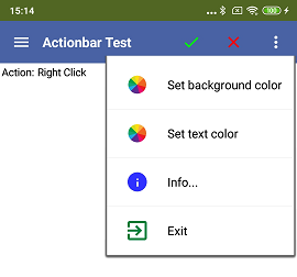
Example ActionBarTest
 |
Most of the functions of the sample app have already been explained above. The menu items are bound to simple actions. The Label component shows which key was pressed. Color selection is done by ColorPickerDialog developed by Zhangzqs. |
Tools
I have gathered some tips for creating your own extensions: AI2 FAQ: Developing extensions.