Motivation
With smaller apps, the implemented functions can be triggered by a button. With larger apps, however, the available space quickly decreases and the layout becomes confusing. A side bar can help here. There are a number of implementations, but I haven't found a sufficiently extensive one and developed one myself. Almost all properties are adjustable. If something is missing, write to me: E-Mail to Ulli.
Version history
| Version | Adjustments |
|---|---|
| 1.0 (2021-01-28) | Initial version |
| 1.1 (2021-10-05) | Event ItemCheckedChanged was not triggered. |
| 1.2 (2022-09-01) | Graphic files from the asset area can be selected as icons for the sidebar items. |
| 1.3 (2023-06-13) | Proprties FontBold, FontItalic, FontTypeface added. |
| 1.4 (2023-06-19) | Exception at FontTypeface == default removed. |
| 1.5 (2024-03-23) | If the orientation has changed, the shadow area was not recalculated. Problem with text display fixed if SideBar has to be scrolled. |
| 1.6 (2024-09-03) | Recompiled with new SDK due to the new App Inventor version geared towards Android 14. |
Contents
Download
The UrsAI2SideBar ZIP archive for download. The archive contains the source code, the compiled binary for uploading to the App Inventor and a sample application.
Usage
Pixel vs. DIP
App Inventor 2 uses the unit of pixels to define the width and height of elements. However, this does not mean a (hardware) pixel on the display, but a DIP (Device Independent Pixel). DIP-Width and DIP-Height are adjusted to the resolution and the dimensions of the display. A DIP therefore has approximately the same dimension on all devices. To avoid confusion, the term DIP is used throughout and unless otherwise specified, DIP is meant.
Detect Swiping
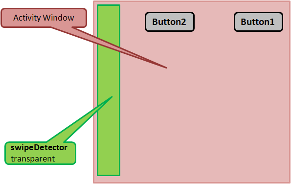
During the creation of the component (constructor), the extension places an additional, narrow, transparent view (SwipeDetector class) over the left edge of the display. Swiping from the left edge of the display to the right to open the SideBar is detected via this strip. The width of the strip can be set using the SwipeDetectorWidth property.
SideBar Structure
After opening the SideBar, the entire display is covered by the SideBarFrame (yellow). SideBarFrame is divided into two areas. On the left a container (listViewContainer, green) for the visible elements of the SideBar and on the right a semi-transparent field (shadowField, violet) that covers the rest of the display.
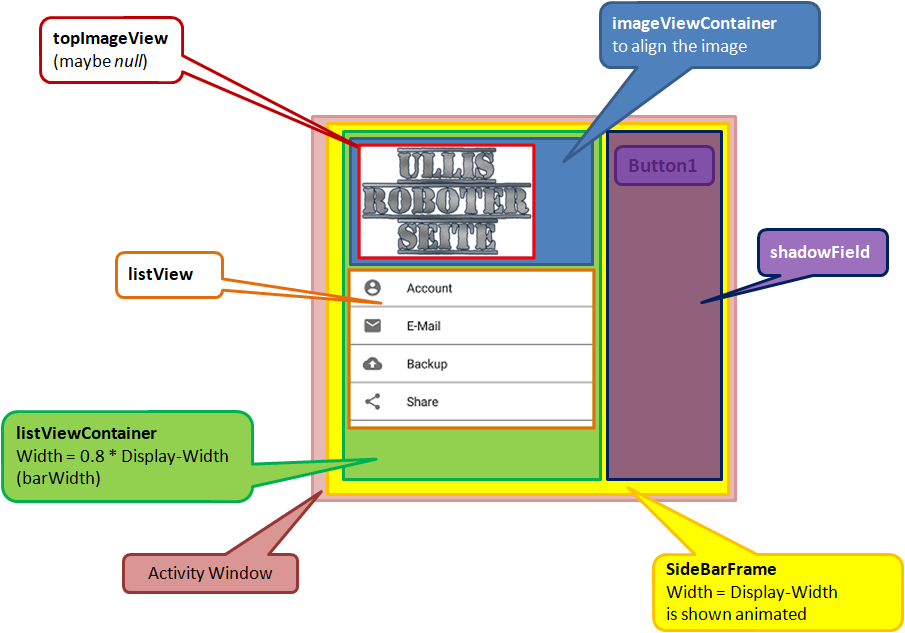
The width of the visible SideBar (= width of listViewContainer) can be specified in percent of the display width via the property SidebarWidthPercentage. The property BackgroundColor defines the background color.
listViewContainer is a container for imageViewContainer, which is used to align the cover picture, and an Android ListView, which contains the actual SideBar items.
The title image is set via the Image property. If None is selected, no picture will be displayed. FitImageSize is used to fit the width of the image to the width of the SideBar. The aspect ratio is retained. Alternatively, the image can be aligned in relation to the SideBar using the ImageAlignment property.
SideBar Items
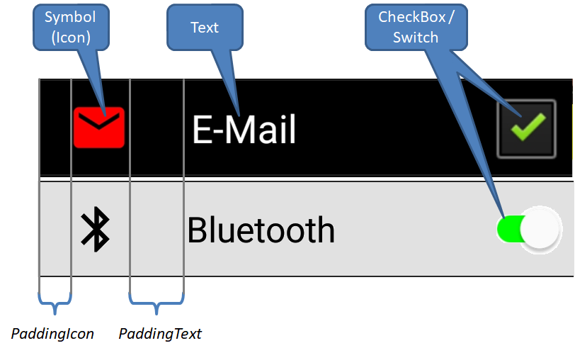
A ListView element consists of up to three components: an optional symbol (Icon), a text field and optionally a CheckBox or Switch.
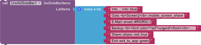
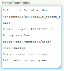
The SideBar items can be defined using the ItemsFromString property using a comma-separated list. Alternatively, the SideBar can be filled from a file (designer property ItemsFromFile or function LoadItemsFromFile). As a third option, the SideBar can be defined using a list (SetSideBarItems function).
The definition for a SideBar item consists of up to four elements, each separated by a double colon ("::"):
<hypertext>[::[<icon name>][::[<icon color>][::<T|F>]]]
- <hypertext> defines the displayed text. The text can contain HTML tags,
e.g.
The <b>quick <i>brown <strike>fox <u>jumps <font color="red">over</font></u></strike><i></b>::info
results into this item:

Which HTML tags can be used varies depending on the implementation of the Android system. There are hints at Mark Murphy's Technical Stuff or Daniel Lew's Coding Thoughts (See also Hypertext for Label, Button and CheckBox). The standard text color is set using the TextColor property.
- <icon name> is optional. A symbol from the Google
MaterialIcons-Font can be specified here. Alternatively,
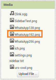
a graphic file can be selected from the asset area. An image size of 192x192 pixels delivers a reasonable result
(at least on my smartphone). To distinguish between the two, the file name must begin with an "@". "info" refers
to the MaterialIcons.Font, "@WhatsApp192.png" refers to an asset file.
- <icon color> is optional and defines the color of the icon. If no entry
is made here, the IconColor property defines the color.
- <T|F> is optional. If an entry is made here, a CheckBox or a Switch is displayed. True or False indicate the initial state of the CheckBox / the Switch. Only the first letter of the specification is evaluated, upper / lower case is irrelevant. No CheckBox / Switch is displayed for anything other than "T, t" or "F, f".
When optional settings are omitted, the separator symbol ("::") must still be specified. Examples of valid definitions:
- "Info...": The SideBar item shows the text "Info...".
- "Info...::email": The SideBar item shows the text "Info..."
and an email icon.
- "Info...::email::red": The SideBar item shows the text "Info..."
and a red email icon. With the ARGB notation #TTRRGGBB (e.g. # FFFF0000 for red) the colors can be specified in
more detail.
- "Info...::email::::True": The SideBar item shows the text
"Info..." and an email icon. The color if the icon is defined by property
IconColor. The item has a CheckBox /
Switch with state "checked".
- "Info...::::::False": The SideBar item shows the text "Info..."
and a CheckBox with state "unchecked".
Definition of the SideBar items via list::
Definition of the SideBar items via a file:
Info...::info::blue
Goto <b>Screen2</b>::mobile_screen_share
E-Mail::email::#ff00ff00::f
Backup <b><font color="red">urgent!</font></b>::backup
Share::share::red::true
Exit::exit_to_app::green
Definition of the SideBar items via the designer property:
Individual SideBar items can be changed later without having to reload a completely new definition. This is done using the SetImtemX functions., e.g. SetItemChecked. The HasItemCheckBox and GetItemChecked functions provide information on whether a SideBar item has a CheckBox / Switch and what its checked state is.
The ItemSelected or Item#Selected event is triggered when a SideBar item without a CheckBox / Switch is tapped. Item#Selected is available five times.
For items with a CheckBox / Switch, the checked state changes when you tap on it. The ItemCheckedChanged event is triggered (ItemSelected is not triggered).
Opening and Closing
The SideBar can be opened in two ways, either by program using the Show function or the user swipes from the left edge of the display o the right. Opening by swiping can be prevented using the Enabled property
Closing is done by calling the Hide function. The user closes the SideBar by tapping the shadow field (see SideBar structure) or swiping from right to left on the SideBar.
The BeforeOpening and AfterClosing events accompany these processes.
The IsOpened property can be used to query whether the SideBar is currently opened.
Item selection by the user
Wird eine SideBar-Zeile durch den Anwender angeklickt, wird das Ereignis AfterSelecting ausgelöst. Die Parameter ItemNo und Title geben Auskunft darüber, welche Zeile angeklickt wurde. Zur Abkürzung um umfangreiche If-Abfragen zu vermeiden, werden für die ersten fünf Zeilen zusätzlich die Ereignisse Item#Selected ausgelöst.
If a SideBar item is clicked by the user, the AfterSelecting event is triggered. The ItemNo and Title parameters provide information about which item was clicked on. As a shortcut to avoid extensive If queries, the Item#Selected events are also triggered for the first five items.
Reference
Note: The properties and functions do not affect an already opened SideBar!
Properties
- BackgroundColor
- Defines the background color of the SideBar. The default is white
- Enabled
- Specifies whether the SideBar is active, i.e. whether it can be opened by swiping.
- FitImageSize
- Specifies whether the width of the cover picture should be adjusted to the width of the SideBar. The aspect ratio is retained.
- FontBold
- Specifies whether the label’s text should be bold. Deafult value for SideBar-Items. Some fonts do not support bold.
- FontItalic
- Specifies whether the label’s text should be italic. Deafult value for SideBar-Items. Some fonts do not support italic.
- FontSize
- Specifies the font size for the SideBar items. The default is 16.0.
- FontTypeface
- Specifies the SideBar items font face as default, serif, sans serif, or monospace..
- IconColor
- Defines the standard color for the symbols in the SideBar items. The default
is black.
If the entries are deactivated, the symbol is displayed with the color defined by TextColorInactive. - Image
- The (asset) file name for the cover image.
- ImageAlignment
- Specifies the alignment of the cover picture in relation to the SideBar: left-justified, centered or right- justified. The default setting is left-justified (1).
- IsOpened
- Indicates whether the SideBar is opened, ie is displayed.
- ItemsFromFile
- The SideBar item definitions are read from the specified (asset) file. For each SideBar item a line of form <hypertext>[::[<icon name>][::[<icon color>][::<T|F>]]] must be specified (see SideBar Items).
- ItemsFromString
- Specifies the SideBar items using a comma-separated list. For each SideBar items, a list item of form <hypertext>[::[<icon name>][::[<icon color>][::<T|F>]]] must be specified (see SideBar Items). Multiple entries are separated by commas.
- PaddingIcon
- Specifies the distance between the left edge of the Sidebar and the icon. The default setting is 16 DIP.
- PaddingText
- Specifies the space between the icon and the text for the SideBar item. The default setting is 32 DIP.
- SidebarWidthPercentage
- Specifies the width of the SideBar as a percentage of the display width. Valid values are 30%.. 90%. The default is 80%.
- SwipeDetectorWidth
- Specifies the width of the SwipeDetector strip. The specification is made in DIP. The default setting is 24 DIP (see Usage).
- SwitchThumbColorActive
- Specifies the Switch’s thumb color when switch is in the On state. The default is white.
- SwitchThumbColorInactive
- Specifies the Switch’s thumb color when switch is in the Off state. The default is light gray.
- SwitchTrackColorActive
- Specifies the Switch’s track color when in the On state. The dafault is green.
- SwitchTrackColorInactive
- Specifies the Switch’s track color when in the Off state. The default is dark gray.
- TextColor
- Defines the standard text color of the SideBar items. The default is black.
- TextColorInactive
- Specifies the text color for inactive SideBar items (text and icon). The default is gray.
- UseSwitches
- Specifies whether Switches should be displayed instead of CheckBoxes. The default is false.
- Version
- Gets the version of the extension.
Functions
- GetItemChecked(ItemNo)
- Get the check status of the specified SideBar item. ItemNo is the number of the entry. Counting starts with 1.
- HasItemCheckBox(ItemNo)
- Gets whether the specified SideBar item has a CheckBox / Switch. ItemNo is the number of the item. Counting starts with 1.
- Hide()
- Closes the SideBar.
- LoadItemsFromFile(FileName)
- Loads die SideBar from the specified file. For each SideBar item a line of form <hypertext>[::[<icon name>][::[<icon color>][::<T|F>]]] must be specified (see SideBar Items).
- SetItemChecked(ItemNo, Checked)
- Defines the checked state of the specified SideBar item. ItemNo is the number of the item. Counting starts with 1.
- SetItemEnabled(ItemNo, Enabled)
- Activates / deactivates the specified SideBar item. ItemNo is the number of the item. Counting starts with 1. Deactivated items are displayed with the color defined in TextColorInactive and do not react to being clicked.
- SetItemIconColor(ItemNo, Color)
- Defines the icon color for the specified SideBar item. ItemNo is the number of the item. Counting starts with 1.
- SetItemIconName(ItemNo, Name)
- Defines the symbol for the specified SideBar item. ItemNo is the number of the item. Counting starts with 1. Name is the name of a character from the MaterialIcons-Font.
- SetItemText(ItemNo, Text)
- Defines the text for the specified SideBar item. ItemNo is the number of the item. Counting starts with 1.
- SetSideBarItems(ListItems)
- Defines the entries of the SideBar via a List. For each SideBar item, a list element of form <hypertext>[::[<icon name>][::[<icon color>][::<T|F>]]] mus be specified (see SideBar Items).
- Show()
- Opens the SideBar (displays it).
Events
- AfterClosing(ByCommand)
- The event is triggered after the SideBar is closed. ByCommand is true if closing was triggered by the Hide function. The value is false if the SideBar was closed by the user by swiping on the GUI.
- AfterSelecting(ItemNo, Title)
- The specified SideBar item was clicked. ItemNo is the number of the item. Counting starts with 1. Title is the text of the item.
- BeforeOpening(ByCommand)
- The event is triggered before the SideBar opens. ByCommand is true if the opening was triggered by the Show function. The value is false if the SideBar was opened by the user by swiping on the GUI.
- AfterClosing(ByCommand)
- The event is triggered after the SideBar is closed. ByCommand is true if closing was triggered by the Hide function. The value is false if the SideBar was closed by the user by swiping on the GUI.
- ItemCheckedChanged(ItemNo, Title, Checked)
- The check status of the SideBar entry has been changed. ItemNo is the number of the item. Counting starts with 1. Title is the text of the item. Checked is the checked state.
- Item#Selected(Title)
- The SideBar item # was clicked. Title is the text of the entry. This event occurs five times.
Example
SideBarTest
 |
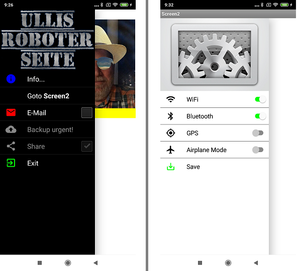
The example is quite simple. It shows different versions of the SideBar on two screens. |
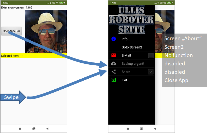 |
The first screen presents some possible SideBar configurations. Only the first two and the last items have are functional. After tapping an activated entry, the parameters of the AfterSelecting event are displayed in the yellow bar. |
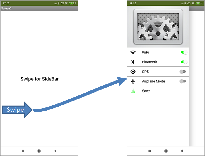 |
The second screen shows how settings can be managed using switches. |
Tools
I have collected some tips for creating your own extensions: AI2 FAQ: Developing extensions. On the page you can find further details too.