Motivation
The MIT App Inventor does not provide a RadioButton. Fortunately, a CheckBox behaves very similarly to a RadioButton. In the Android operating system, both controls are derived from the same base class (CompoundButton). With this extension, CheckBoxes can be converted into RadioButtons. The advantage of WYSIWYG is retained.
| Version | Adjustments |
|---|---|
| 1.0 (2023-12-22 | Initial version |
| 1.1 (2025-09-14) | Function setBorder added. |
Download
The ZIP archive UrsAI2RadioButton for download. The archive contains the source code, the compiled binary for uploading to the App Inventor and a sample application.
Usage
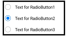
The extension can be used to convert CheckBoxes into RadioButtons. RadioButtons are usually bundled into a group. The extension ensures that exactly one RadioButton is selected within a group. The appearance is roughly as follows:
The MIT App Inventor does not allow the integration of user-developed, visible elements. However, it is possible to modify visible elements. This extension changes the appearance of a CheckBox to that of a RadioButton. It also ensures that only one of the converted CheckBoxes (now RadioButton) can be selected (checked) within a group.
The CheckBoxes that are to be converted must be placed within a layout (arrangement). This layout also forms the group for the RadioButton..
The SetLayout function is used in the Screen.Initialize event to tell the extension within which layout the CheckBoxes are to be converted:
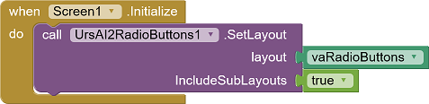
The IncludeSubLayouts parameter can be used to set whether only the CheckBoxes directly contained in the layout should be converted and belong to the group or whether subordinate layouts should also be included. In the example, right-aligned CheckBoxes (and therefore also RadioButtons) are realized by using a CheckBox without text. The text is added via a Label. Both CheckBox and Label are arranged in a HorizontalArrangement. These CheckBoxes are also converted via IncludeSubLayouts = true.
A separate instance of the extension must be used for each RadioButton group. A second call to SetLayout has no effect.
The distances between the individual elements within an Arrangement are relatively narrow. The designer properties IncreasePaddingXxx can be used to increase the spacing in the corresponding direction.
API
Properties
- IncreasePaddingBottom
- Increases the bottom padding of all affected RadioButtons.
- IncreasePaddingLeft
- Increases the left padding of all affected RadioButtons.
- IncreasePaddingRight
- Increases the right padding of all affected RadioButtons.
- IncreasePaddingTop
- Increases the top padding of all affected RadioButtons.
Functions
- SetBorder (Component , Color, Width, ExtendPadding)
- Ensures that a frame with the width Width (in DIP) in the color Color is drawn around the component. The frame is drawn in the area of the component. This reduces the distance between the content of the component and its edge. If ExtendPadding is set to true, this is compensated for by extending the padding.
- SetLayout(Layout, IncludeSubLayouts)
- Registers the specified layout as a RadioButton
group and converts the contained CheckBoxes into
RadioButtons. If IncludeSubLayouts is true,
the CheckBoxes in subordinate layouts are
also included.
A separate instance of the extension must be used for each RadioButton group. A second call of SetLayout has no effect.
Events
- CheckBox.Changed()
- The Changed event of the RadioButtons (CheckBoxes) is only triggered if the RadioButton is selected, i.e. changes to the checked = true state.
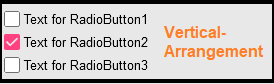
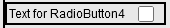
Example
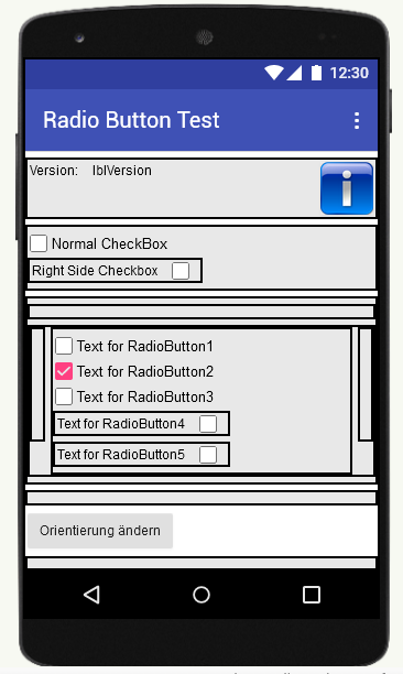
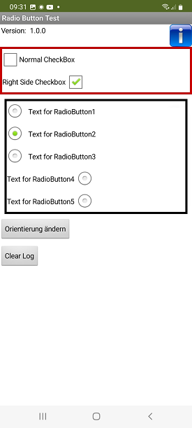
 |
The following images show the view in developer mode and twice at runtime. |
 |
 |
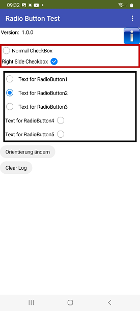 |
| Developer mode | runtime theme = Classic | runtime theme = Default |
Tools
For developing own extensions I gathered some tips: AI2 FAQ: Develop Extensions.