Motivation
The elements that could be displayed in the UrsAI2SideBar extension were limited to those programmed in the extension. This is a different way of designing a SideBar. The basis is a layout (an arrangement) that is superimposed on the screen display. This means that everything that can be placed on an arrangement can also be used in the sidebar. Control is also simplified.

Version history
| Version | Adjustments |
|---|---|
| 1.0 (2023-12-16) | Initial version |
Contents
Download
The UrsAI2SideBar2 ZIP archive for download. The archive contains the source code, the compiled binary for uploading to the App Inventor and a sample application.
Usage
First, an arrangement must be created with the components that are to be displayed in the SideBar. It makes sense to use a VerticalScrollArrangement. The arrangement is registered with the extension using the Layout function. This is best done in the Screen.initialize event.
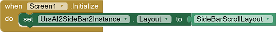
It is possible to use this function to define a different arrangement as SideBar content during the course of the application.
Note: The exact calculation of the height when using a VerticalScrollArrangementis not always exact. It is recommended to insert a small element without content (e.g. HorizontalArrangement) with a fixed height at the bottom edge.
Detect Swiping
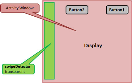
During the creation of the (constructor), the extensions places an additional small transparent view over the left edge of the display. Swiping from the left edge of the display to the right to open the SideBar is detected via this strip. The width of the strip can be set using the SwipeDetectorWidth property.
SideBar Structure
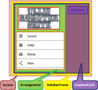
After opening the SideBar, the entire display is covered by the SideBar (yellow). The SideBar is divided into two areas. Arrangement (green) on the left for the visible elements of the SideBar and a semi-transparent field (purple) on the right that covers the rest of the display.
When opening and closing, the arrangement is moved into the screen from left to right. At the same time, the shadow field darkens the rest of the screen. The color of the shadow field can be set using the ShadowColor property. The ShadowAlpha property defines the transparency of the shadow field. 0.0 for completely transparent and 1.0 for completely opaque.
Opening and Closing
The SideBar can be opened in two ways, either by program using the Show function or by the user swiping from the left to the right edge of the display. Opening by swiping can be disabled via the Enabled property.
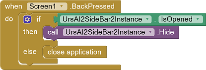
The SideBar is closed by calling up the Hide function. The user closes the SideBar by tapping on the shadow field (see SideBar structure) or swiping from right to left on the SideBar. The BackPressed event cannot be intercepted by the extension. A corresponding program block must be integrated here.
Closing the sidebar by swiping or tapping the shadow field can be prevented using the PreventFromClosing property.
The BeforeOpening, AfterOpening, BeforeClosing and AfterClosing events accompany these processes. BeforeOpening can be used, for example, to adjust the SideBar. BeforeClosing allows you to check the content, for example.
The IsOpened property can be used to query whether the SideBar is currently open.
Reference
Note: The properties and functions do not affect an already opened SideBar!
Properties
- Enabled
- Specifies whether the SideBar is active, i.e. whether it can be opened by swiping.
- IsOpened
- Indicates whether the SideBar is opened, ie is displayed.
- PreventFromClosing
- Determines whether the sidebar can be closed by swiping or by tapping the shadow field.
- SwipeDetectorWidth
- Specifies the width of the SwipeDetector strip. The specification is made in DIP. The default setting is 24 (DIP).
- ShadowColor
- Defines the color of the shadow field. The default setting is gray.
- ShadowAlpha
- Defines the transparency of the shadow field. 0.0 for completely transparent and 1.0 for completely opaque. The default setting is 0.5.
- Version
- Gets the version of the extension.
- VersionSDK
- Gets the android version.
Functions
- Hide()
- Closes the SideBar.
- Layout(Arrangement)
- Defines the arrangement to be displayed in the sidebar.
- Show()
- Opens the SideBar (displays it).
Events
- AfterClosing(ByCommand)
- The event is triggered after the SideBar is closed. ByCommand is true if closing was triggered by the Hide function. The value is false if the SideBar was closed by the user by swiping on the GUI.
- AfterOpening(ByCommand)
- The event is triggered after the SideBar has been opened. ByCommand is true if the opening was triggered by the Show instruction. The value is false if this was triggered by the user swiping on the user interface.
- BeforeClosing(ByCommand)
- The event is triggered before the SideBar is closed. ByCommand is true if the opening was triggered by the Show function. The value is false if the SideBar was opened by the user by swiping on the GUI.
- BeforeOpening(ByCommand)
- The event is triggered before the SideBar opens. ByCommand is true if the opening was triggered by the Show function. The value is false if the SideBar was opened by the user by swiping on the GUI.
Example
SideBar2Test
 |
The example is not particularly demanding. It allows you to switch between two variants of the SideBar. It also shows how to use the BeforeClosing event to check the input. |
Tools
I have collected some tips for creating your own extensions: AI2 FAQ: Developing extensions. On the page you can find further details too.